
June 2026
MAKiNG FiNANCiAL SYSTEMS FEEL EASY
Exploring the importance of highlighting guardrails to support the comprehension of a feature.
Theme: E-commerce
Role: Product Design [web, iOS, android]
Timeframe: 4 months
Overview
Problem
Web experience highlighting unclear copy, confusing hierarchy, transfer timing, outdated/inconsistent components.
Mobile experience highlighting unclear copy, confusing hierarchy, transfer timing, outdated/inconsistent components.
What we already knew
constraints
Designing for trust

Make system rules visible
I introduced contextual Infoboxes to explain transfer rules and other information that could affect a user's decision.

Communicate constraints honestly
Where an action couldn't be completed, Snack bars and validation messaging explained why, rather than leaving users to discover the limitation afterwards.

Confirm important actions
When users changed persistent transfer preferences, the experience clearly confirmed what had been saved. This was particularly important for automatic transfers, where users were changing how their money would be managed in the future.

Keep the experience consistent across platforms
I kept the experience consistent across web, iOS and Android while respecting the interaction patterns of each platform and ensuring system behaviour was communicated consistently across states.
Designing for clarity

Use plain, user-focused language
Copy was rewritten to explain what users could do and what would happen next, rather than relying on financial-system terminology.

Explain complexity at the point of decision
Relevant information was surfaced alongside the decision it affected, rather than requiring users to understand the transfer system upfront.

Make transfer timing clearer
Transfer timing was a major source of uncertainty. The redesign made it clearer when transfers would be processed and when sellers could expect their funds to arrive.
Designing for control
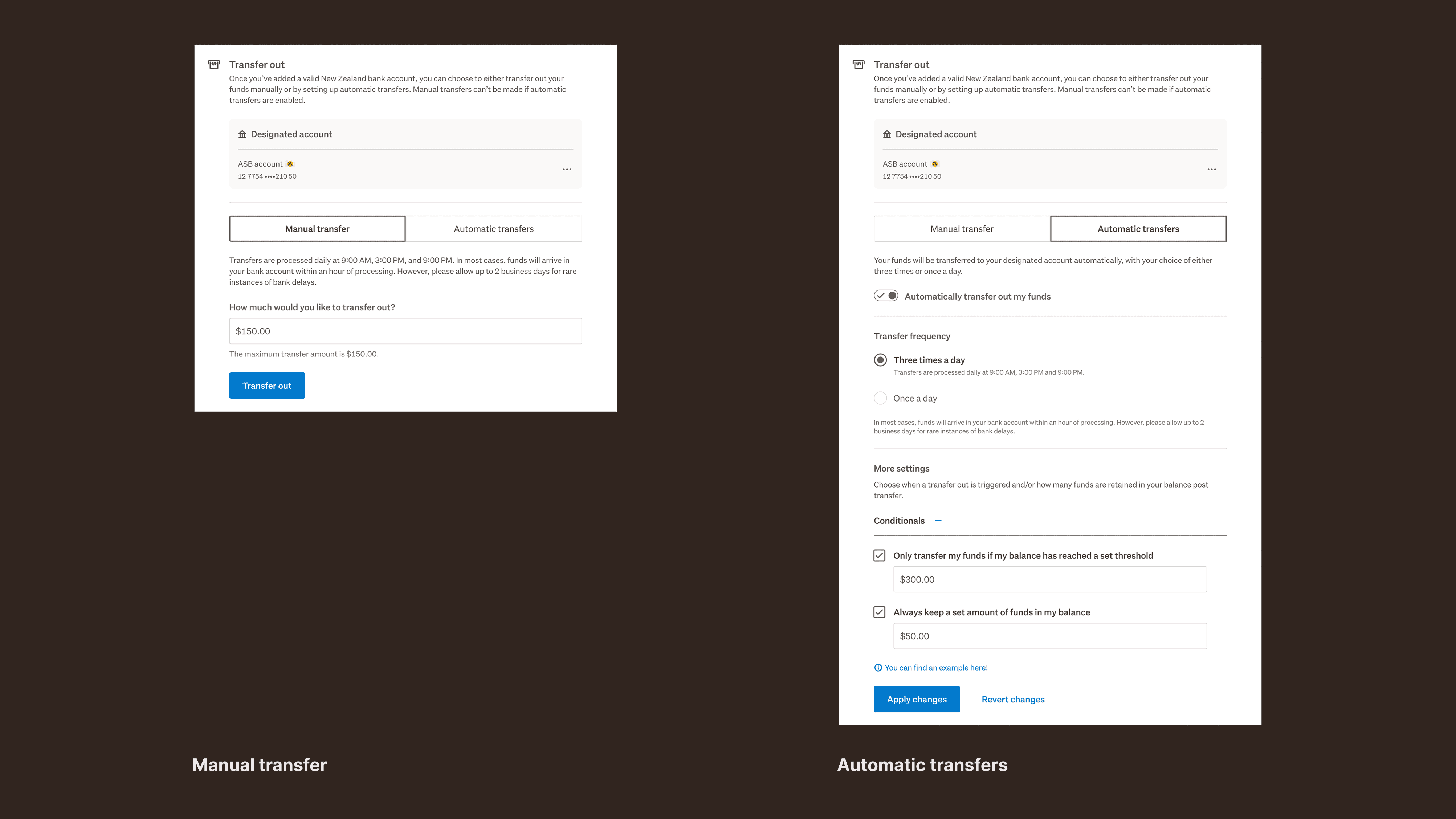
Separate actions from settings
I treated automatic transfers as a setting rather than another transaction, giving users a clearer way to understand and manage their preferences.

Show functionality when it's needed
I showed additional options only when they became relevant, rather than exposing every available setting at once, which kept the experience simpler while still giving users access to more control.
Make control consistent across platforms
Automatic transfers weren't previously available on mobile. I brought the functionality across web, iOS and Android while respecting the interaction patterns of each platform.
Impact

New mobile experience for manual transfers.

New mobile experience for automatic transfers.
Learnings
key takeaway
When system constraints can’t change, improving how the system is understood can be just as impactful as improving the system itself.