
May 2025
MAKiNG USERS FEEL SAFE iN DiSRUPTiVE MOMENTS
Exploring how a compliance-driven piece of work can be implemented with no negative impact on a user and a business.
Theme: Payments & Compliance
Role: Product Design, Research, Testing
Timeframe: 3 months
Context
Trade Me needed to comply with new payment security requirements that asked for sensitive card data to be handled in a separate environment. This meant redesigning the “Add a card” experience to include a redirect to a secure external page, as this was currently handled within the main flow.

Problem
Moving users out of the main experience introduced a high-risk moment. Trade Me having seen an increase in scams, users were very likely to perceive this redirect as unsafe or suspicious, leading to drop-off at a critical point in the payment flow.

Why this mattered
Failure to meet compliance requirements would have blocked all transactions on the platform. At the same time, any loss of user trust during payment would directly impact conversion and trust in the platform.
Approach
I led the design of the new card entry experience across multiple entry points.
To inform decisions, I:
Analysed internal data to understand usage and risk exposure (e.g. how many card data entries happen per week)
Reviewed industry patterns (e.g. how do other products redirect their users in a high-risk moment)
Ran unmoderated usability testing on different redirect approaches (e.g. knowing that the redirect had to happen, how could we create it with less or no friction)
Discovery took up the biggest chunk of work for this project. There were a lot of unknowns and the best way to tackle these, in my opinion, was to do a lot of research into industry and best practice standards.
I used Baymard to understand how other E-commerce platforms tackle problems around redirects and high-risk payment moments without losing user trust.
To understand the impact the redirect could have on our users, I ran unmoderated usability testing using Ballpark. The focus was on language and where the redirect happens (e.g. new tab, new window, new page).
From all of this research, a key insight emerged: Users didn’t strongly prefer how the redirect happened, but needed to feel confident and understand what was happening.
Solution
What changed for users
A clearly guided transition into a secure card entry step
Consistent messaging before, during, and after the redirect
A visually cohesive experience that still felt like Trade Me
What I intentionally didn’t do
Did not prioritise novel interaction patterns over familiarity
Did not rely on the Ping branding to leverage trust, as the product wasn't well-known among users

Designing for trust

Primed users at the entry point with clear expectation-setting copy
Introduced a “secure card entry” feature identifier which is carried across both pages

Matched visual design (colour, typography, layout) to the Trade Me design system, even though we couldn't use the actual components
Designing for clarity

Used dynamic, context-aware copy across different entry points
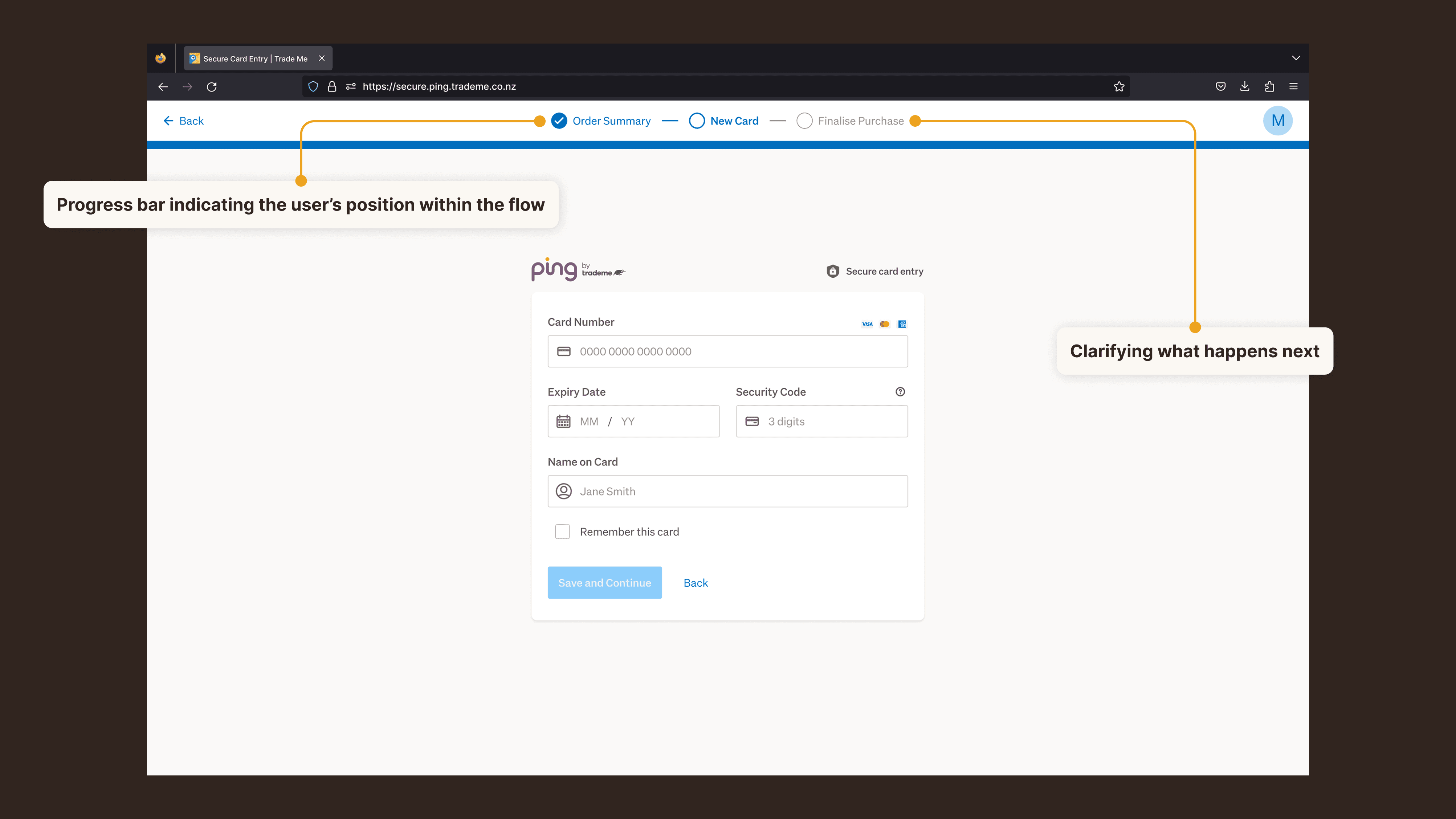
Added step indicators and account cues to reinforce continuity
Ensured users understood they would return to their original flow
Outcome & impact
The solution was shipped within the three-month timeframe
No negative impact on card addition rates post-launch
Maintained stable user behaviour across a high-risk interaction
Successfully mitigated a platform-critical business risk
key takeaway
Even when technical constraints dictate the interaction, trust can be preserved by designing the transition itself. The key factor is in setting expectations clearly and maintaining continuity across the experience.